A friendly rebrand
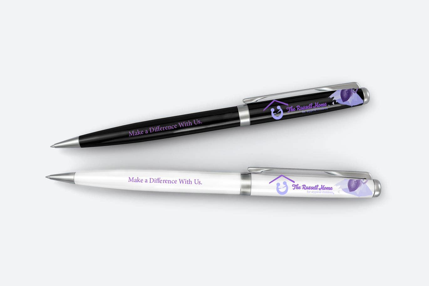
A rebrand for The Russel Home, a local non-profit organization for children with special needs. The goal for the design was to use soft colors and make the designs look friendly and welcoming. A water color design was utilized for a homey feel.
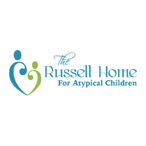
Original Logo
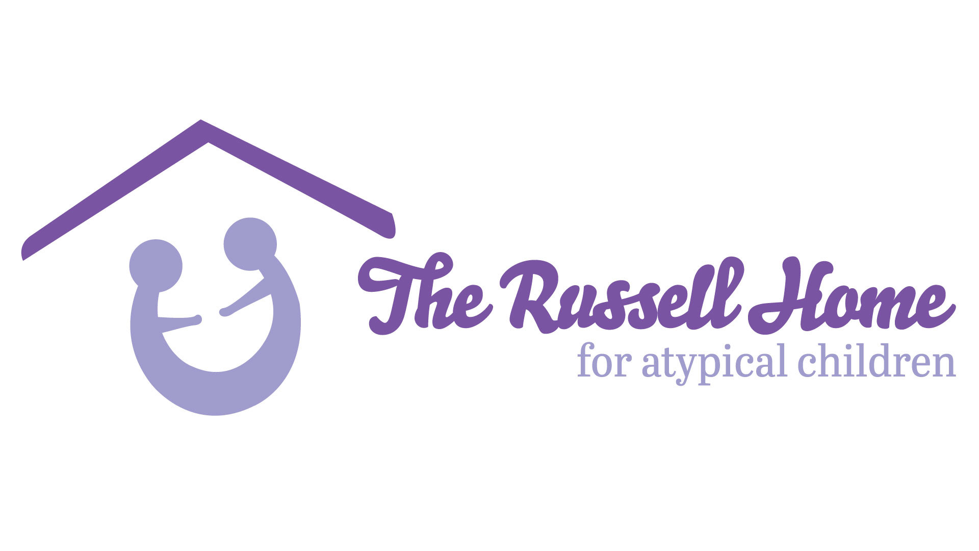
Redesigned Logo

Logo Variations
authentic yet new branding
The original logo for The Russell Home showed two figures forming a heart. I wanted to honor that in the rebrand by keeping the two figures and placing them under a rooftop. The fonts, soft purple color scheme, and water color patterns were meant to evoke a feeling of warmth, friendliness, and acceptance. The home is meant to help children and I wanted the logo and colors to reflect this. The crookedness to the roof is meant to add charm and an arts-and-crafts feel.
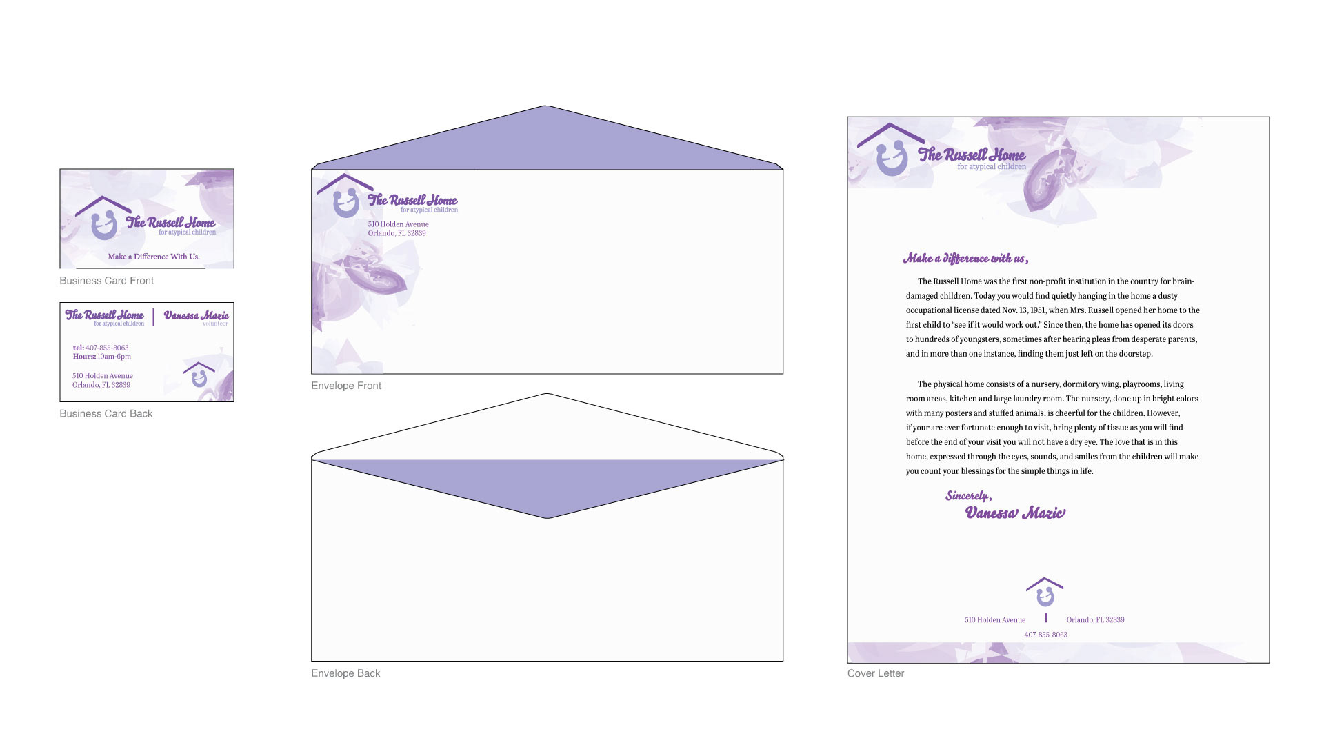
Stationary Set
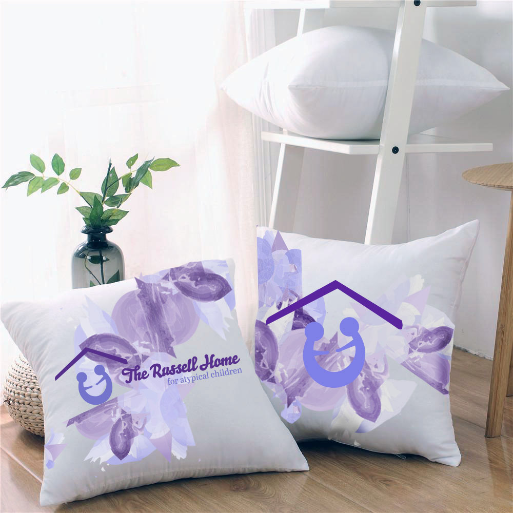
Throw Pillows
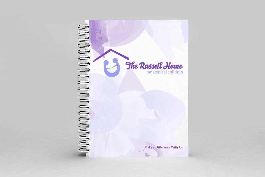
Spiral Notebook
