a Homage to my roots
Drunken Balkan is a fictional alcohol company inspired by the Balkan region in Europe. The main inspiration for the brand was Croatia and I wanted to create something based in and honoring my heritage. Many of the countries in this region have a strong base in Catholicism and many depictions of the Virgin Mary can be seen hanging in homes. The voice for this brand is comical yet authentic to everyday imagery that is seen throughout Balkan countries. It is a nod at the shared culture and lifestyle while taking a humorous stance on the design through the logo and how it is implemented in the packaging design.
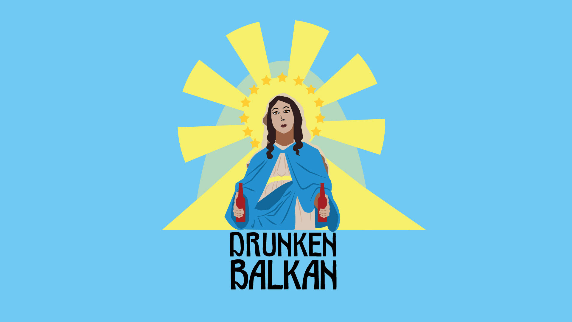
Detailed Logo
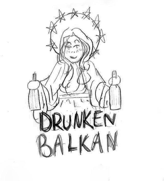
Logo Sketch
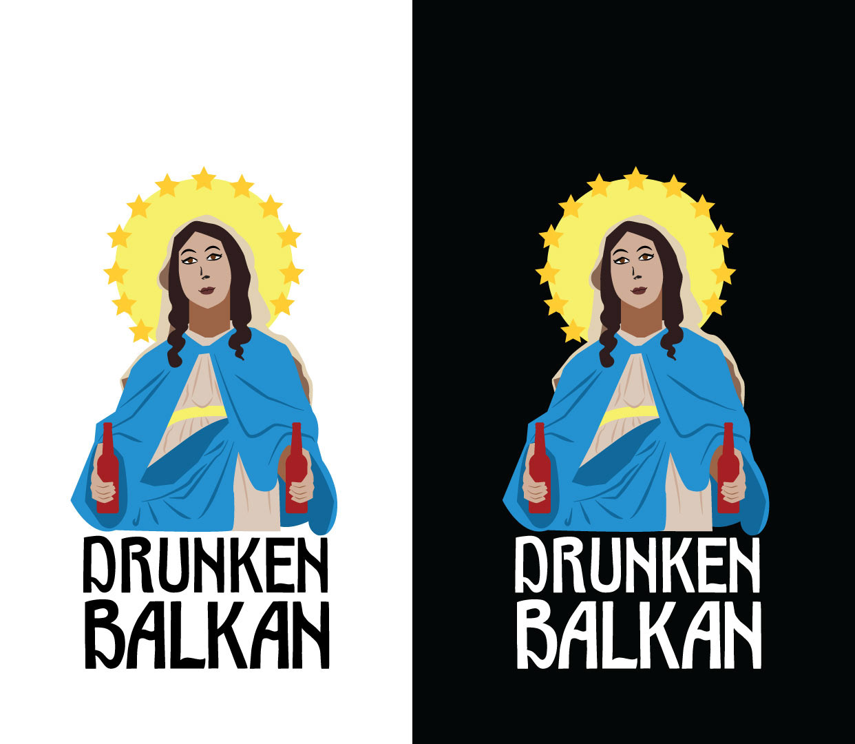
Final Logo
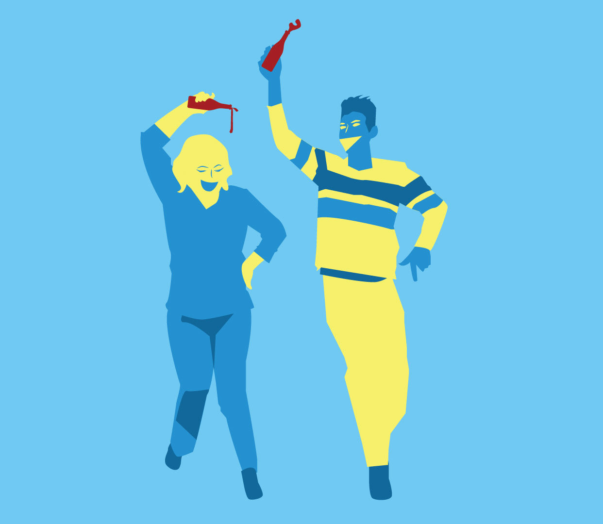
Dancing Balkans
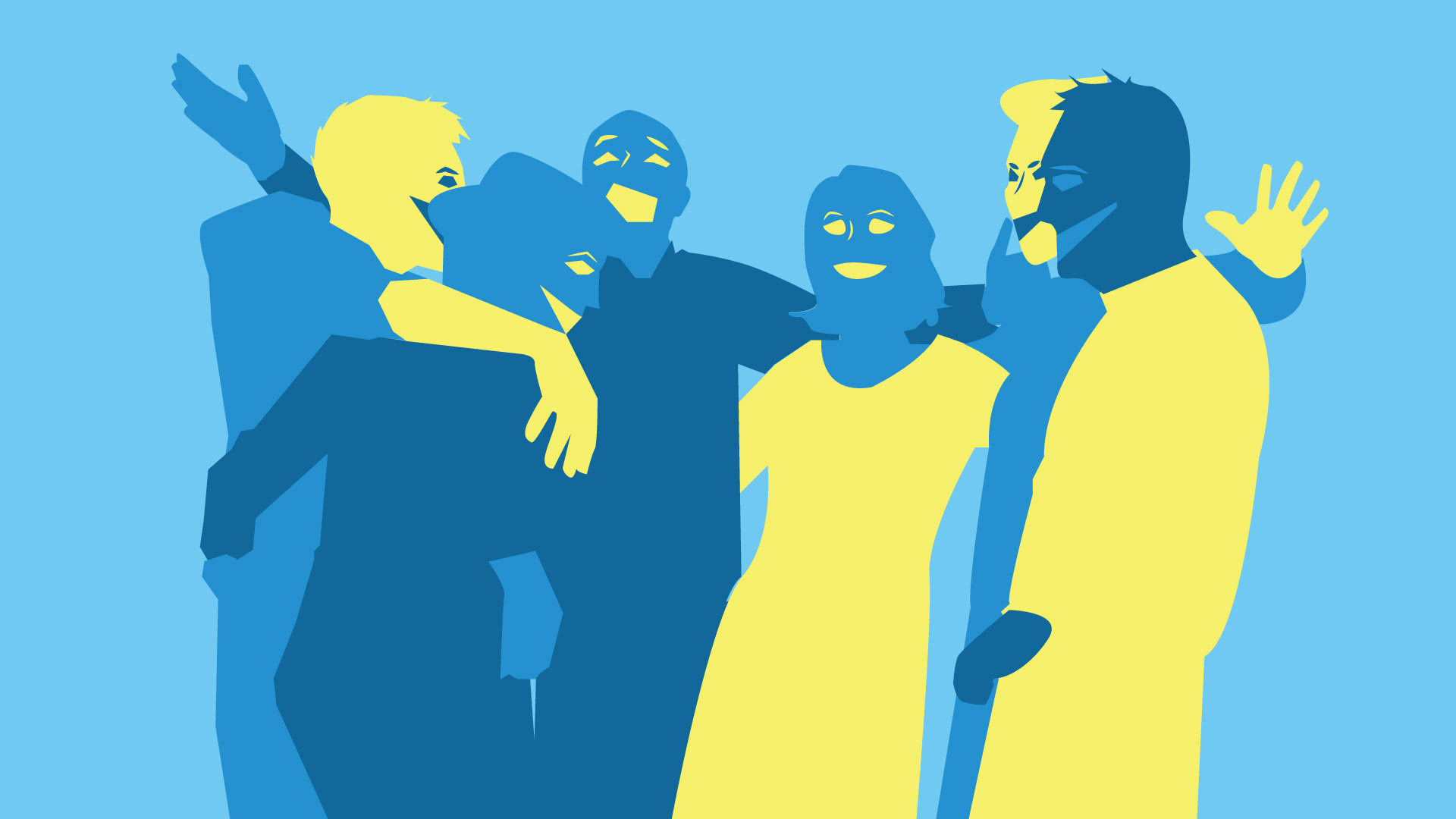
Singing Balkans

"Drunken Balkan" Font
CAPTURING AN EXPERIENCE THROUGH DESIGN
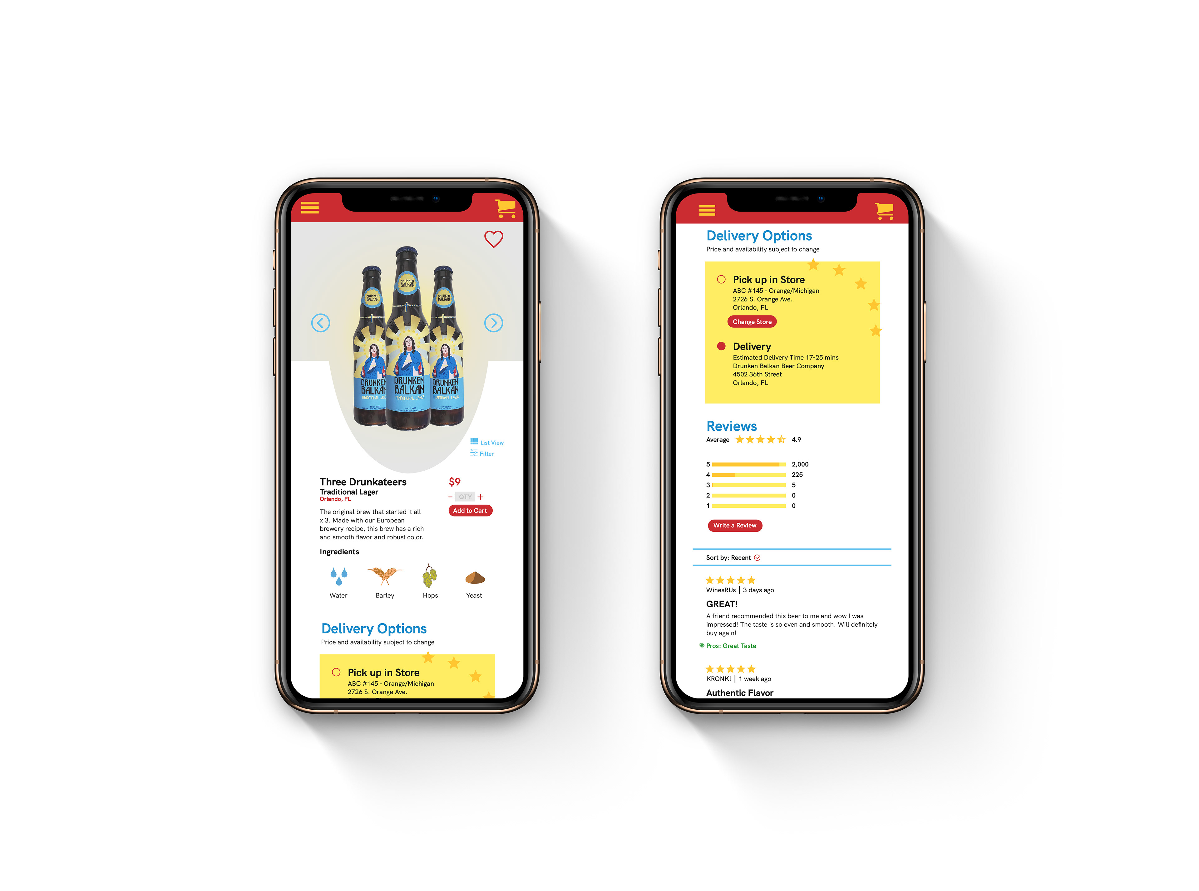
This project was heavily inspired by my family in Croatia, and I wanted to capture the experience I felt when I was there. Drinking was a large part of the experience and I decided to create a logo that featured the Virgin Mary bringing beer. The use of this specific religious imagery is a nod to Croatian culture and the heavy influence Catholicism has throughout the Balkans. I used a color scheme that was indictive of prominent religious colors and featured a red in the app designs to add variation and allude to both blood and beer. The additional figures are less refined and done in a different style than Mary because they are not the main focus. While I wanted to be comical with the religious imagery I still wanted to give dignity to how Mary was illustrated compared to everyone else. The use of stars throughout the design is a nod to Bosnia and Herzegovina. I also used sharp and bold shapes to capture the prominent and common design choices used throughout that region which inspired my font. I wanted it to have power and sharp edges while also having a distinct personality and playfulness. The unevenness of the font and the mixture of sharpness and curvature contributes to the idea that this is an alcohol product and not meant to be refined or perfect. It integrates a feeling of modernness while still having a medieval structure.
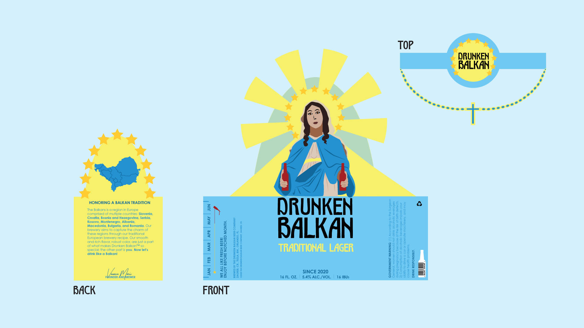
Bottle Design
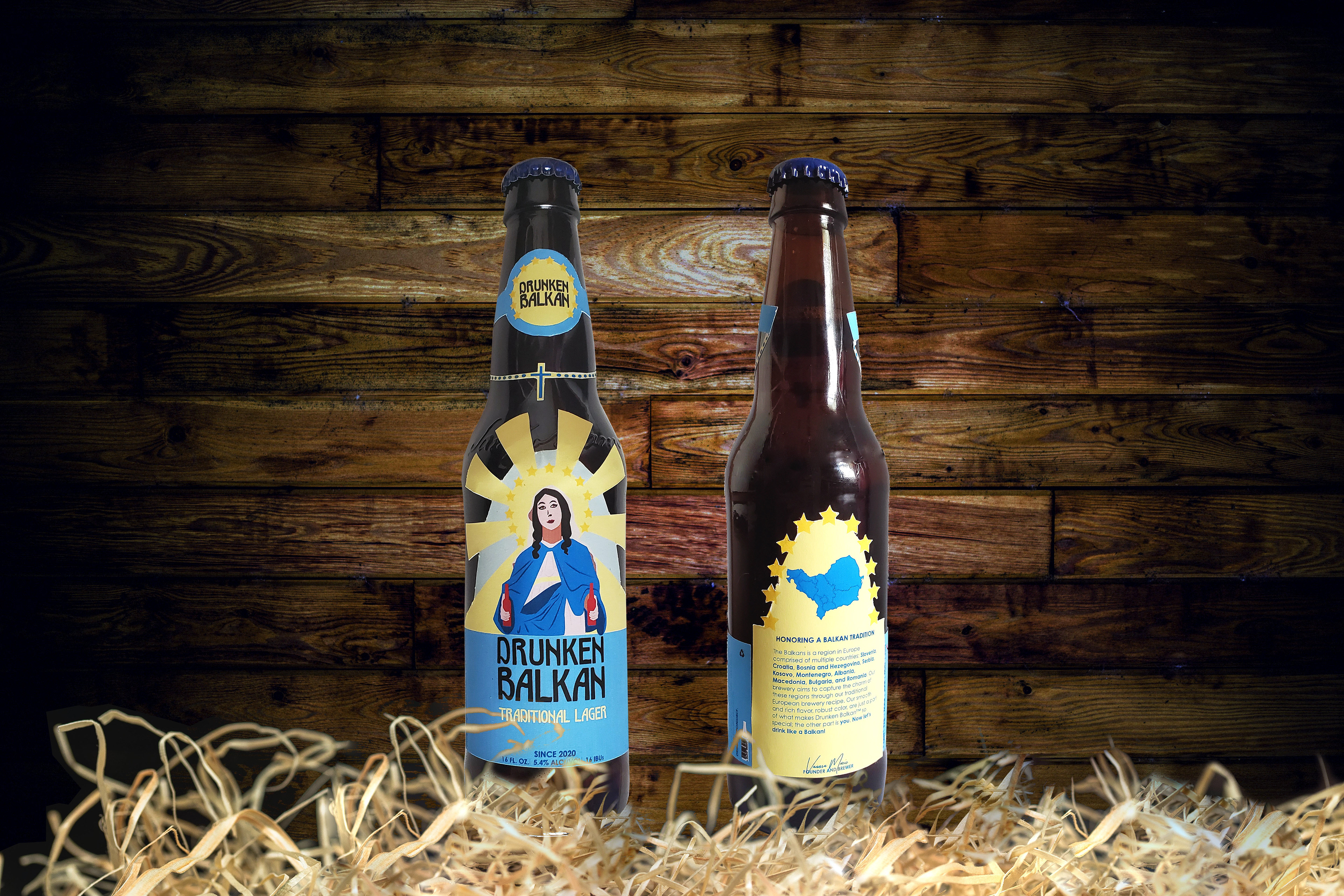
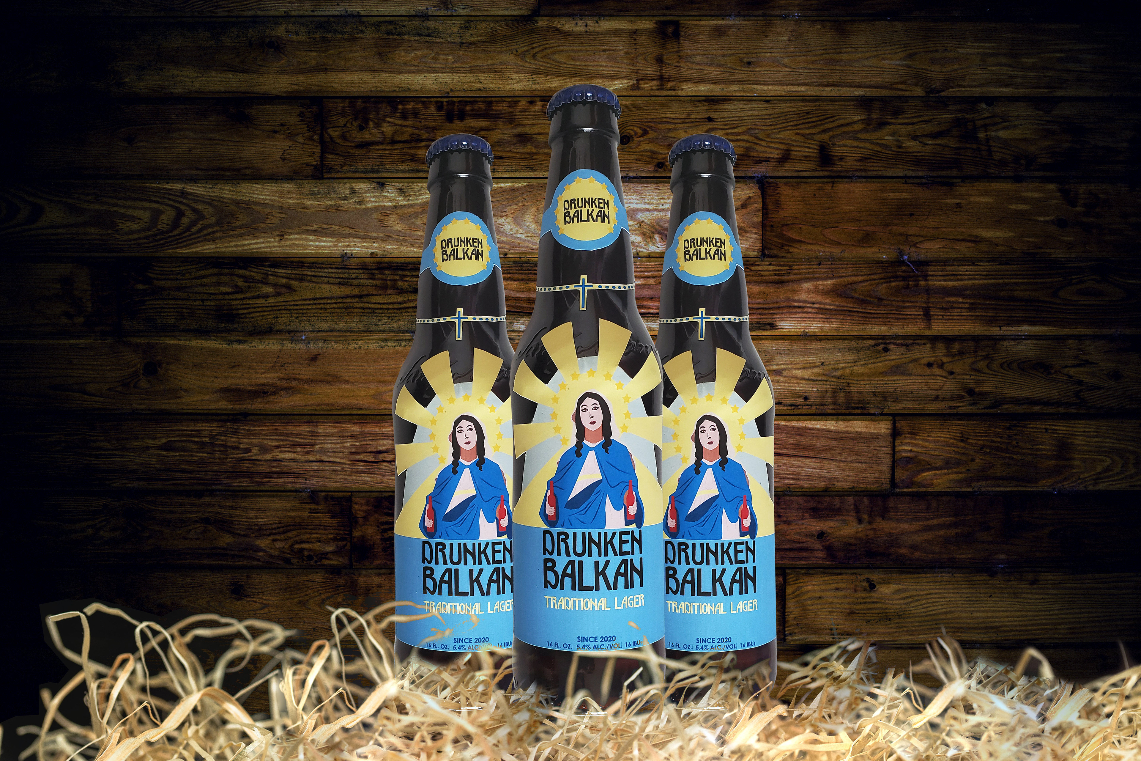
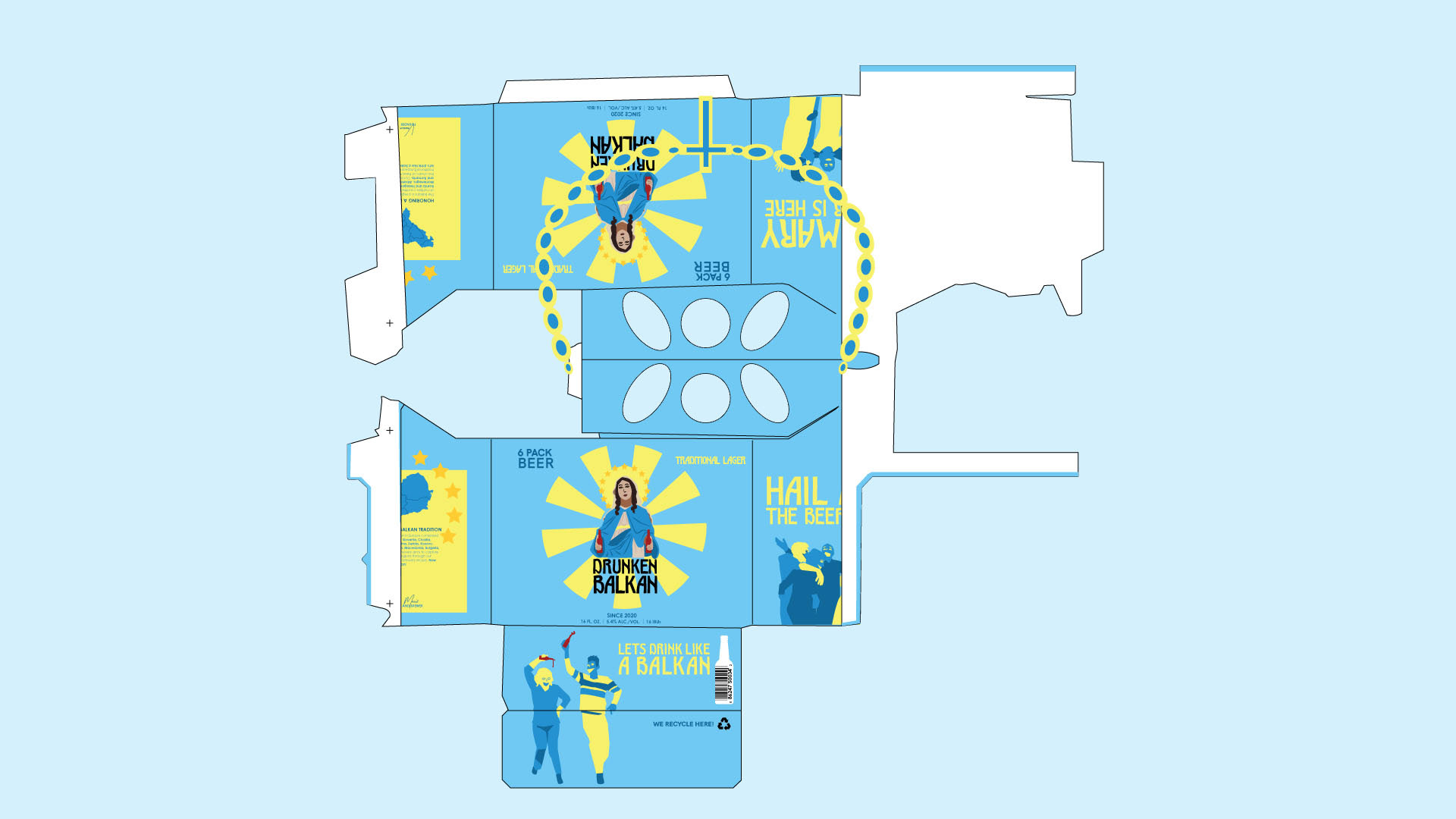
Beer Box Design
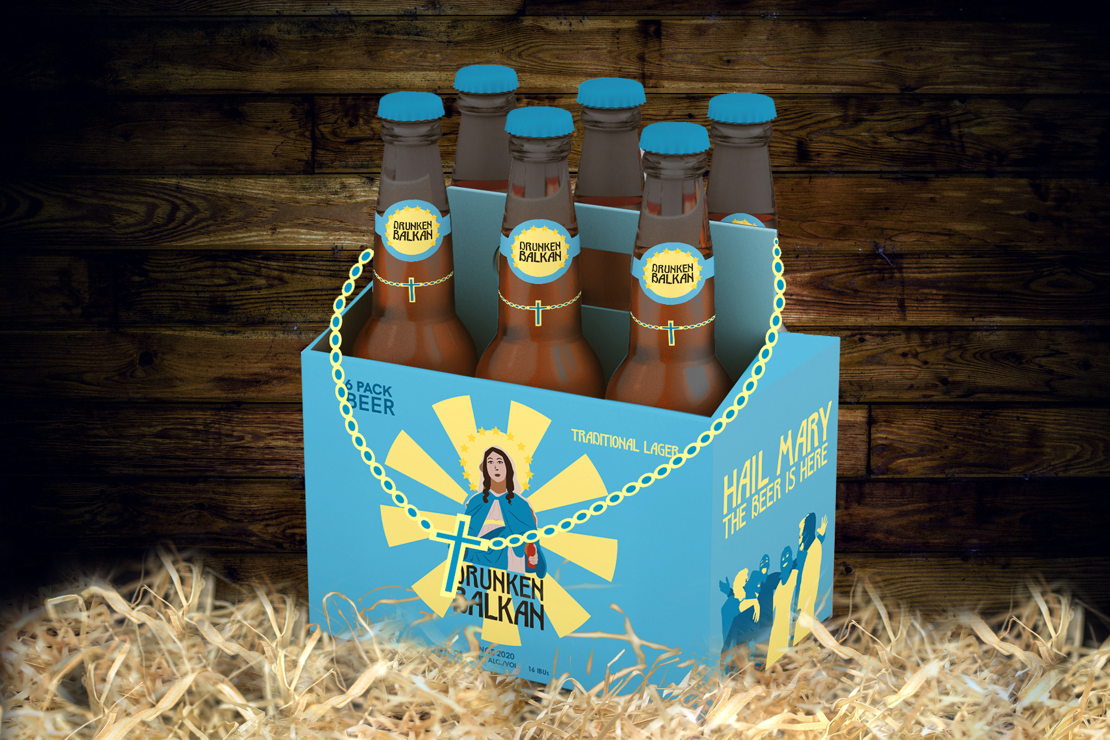
Beer Box: View One
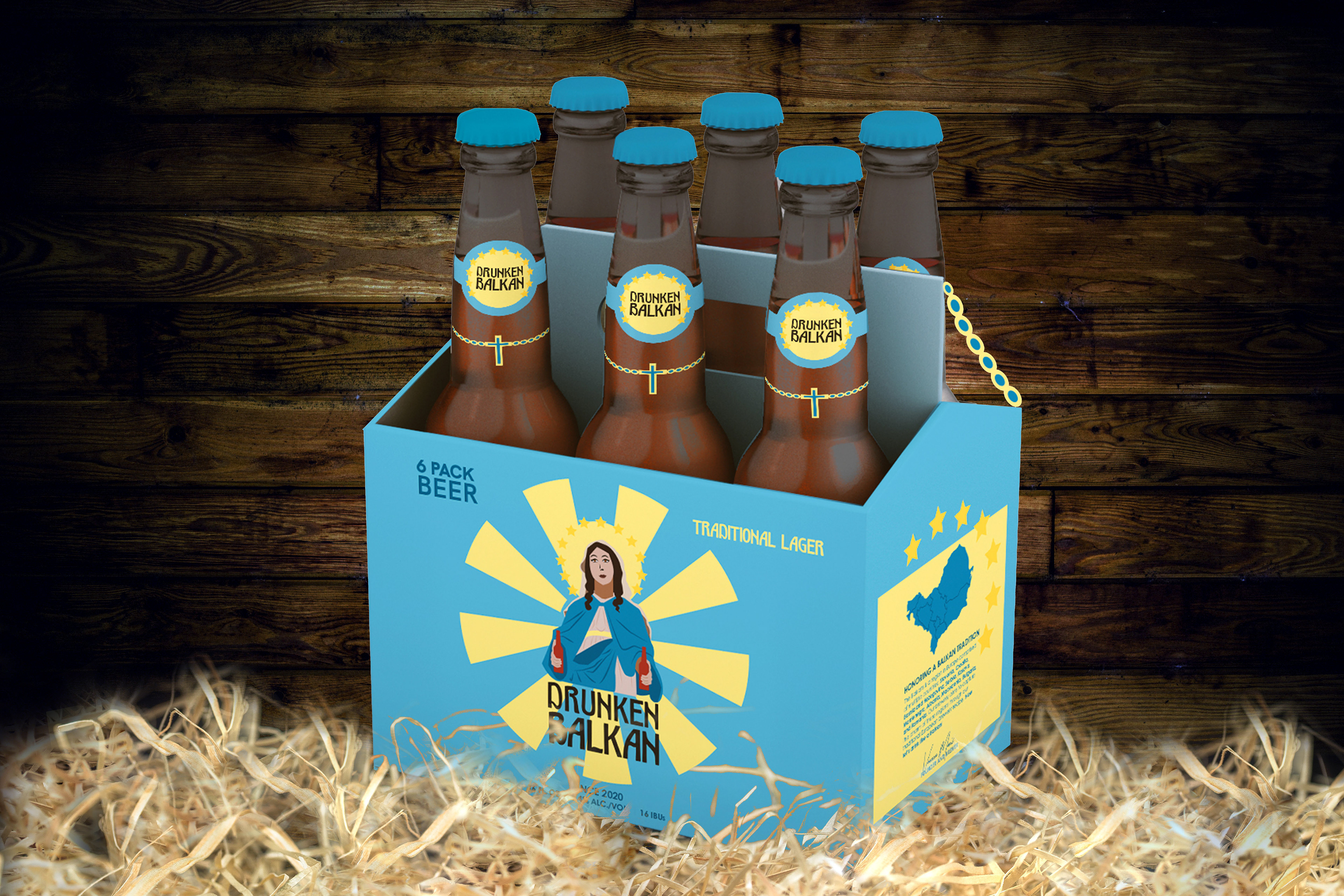
Beer Box: View Two
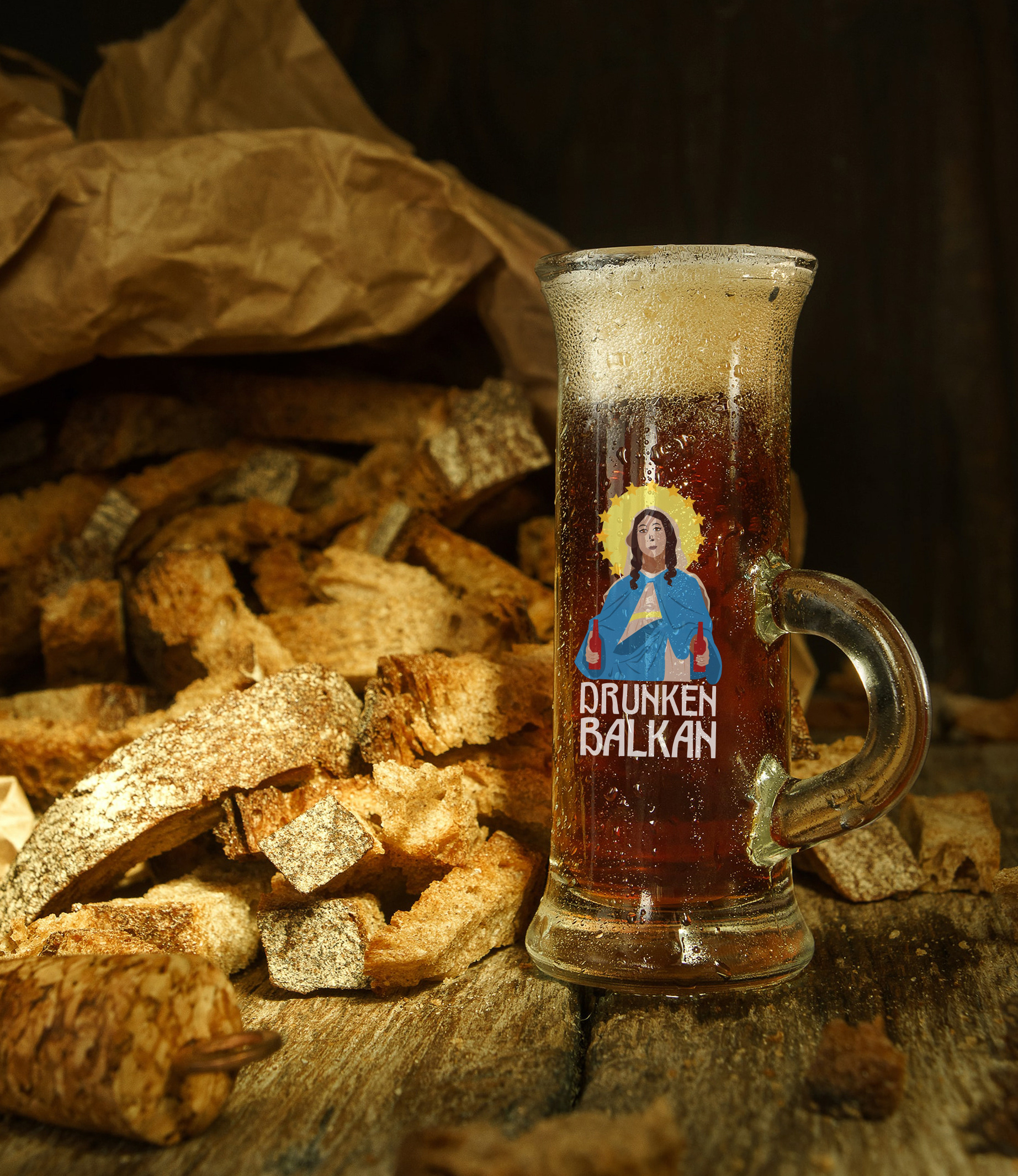
Advertisement for Website
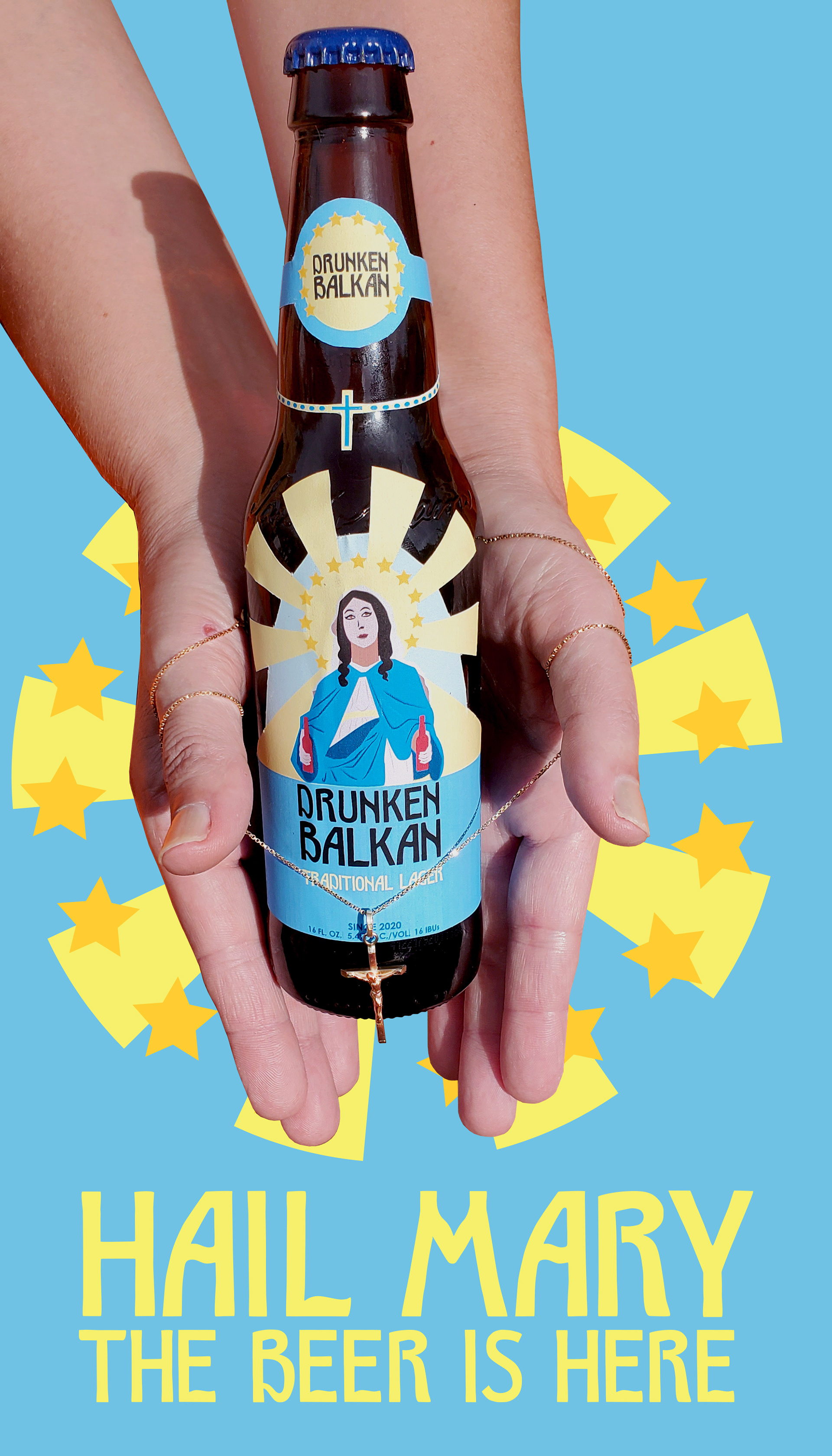
Advertisement for Magazine
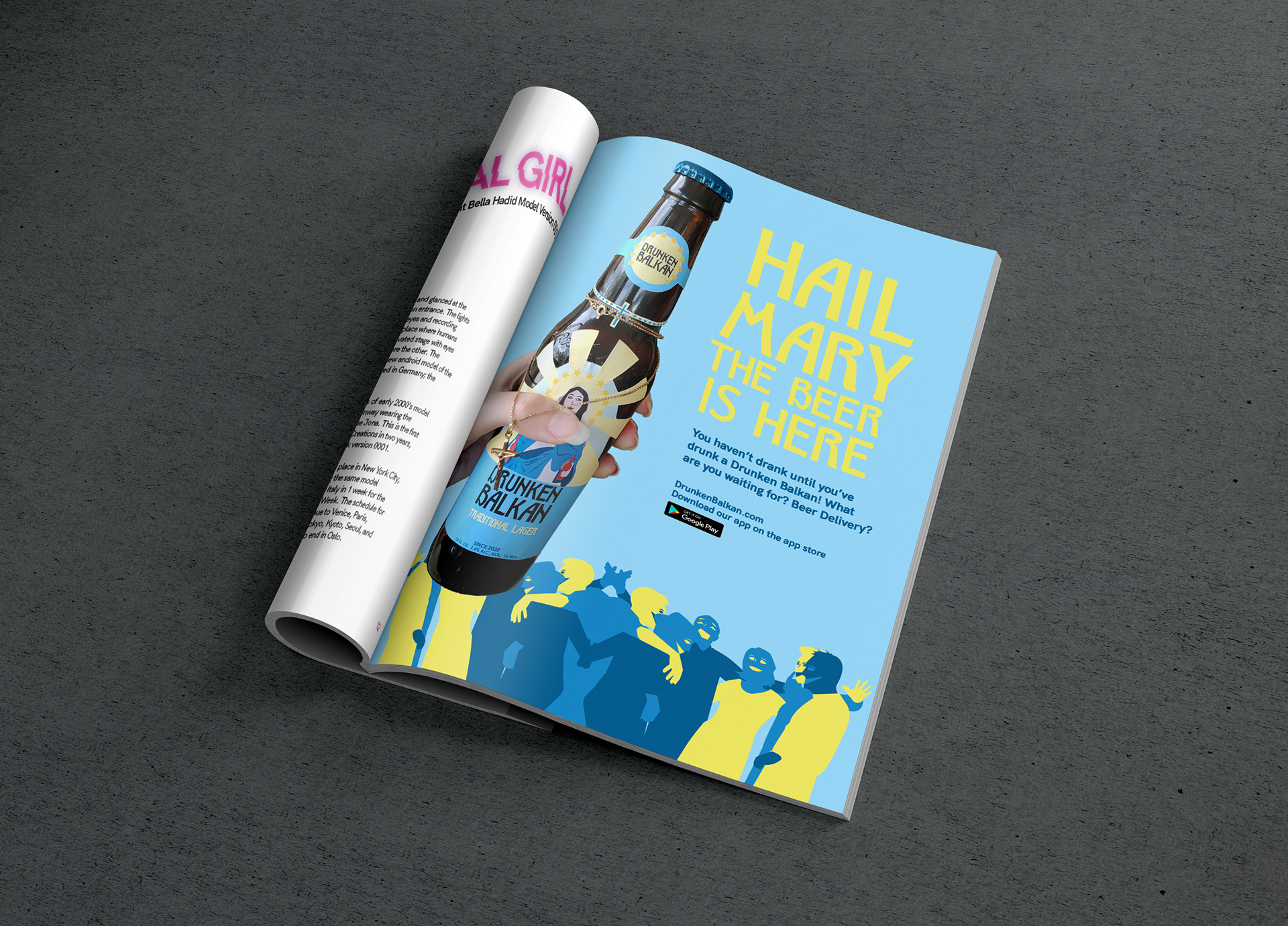
Magazine Ad
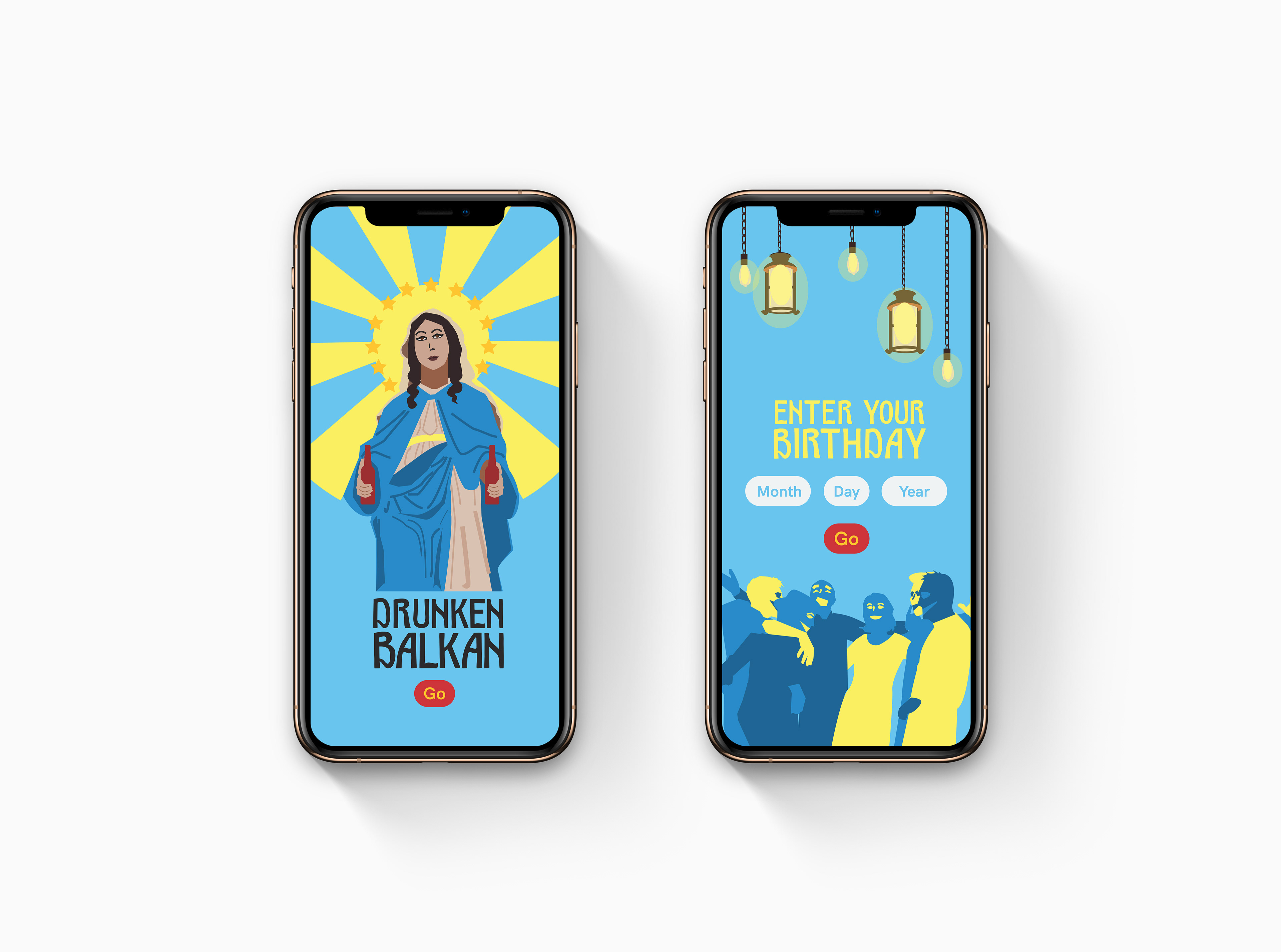
Landing Screen
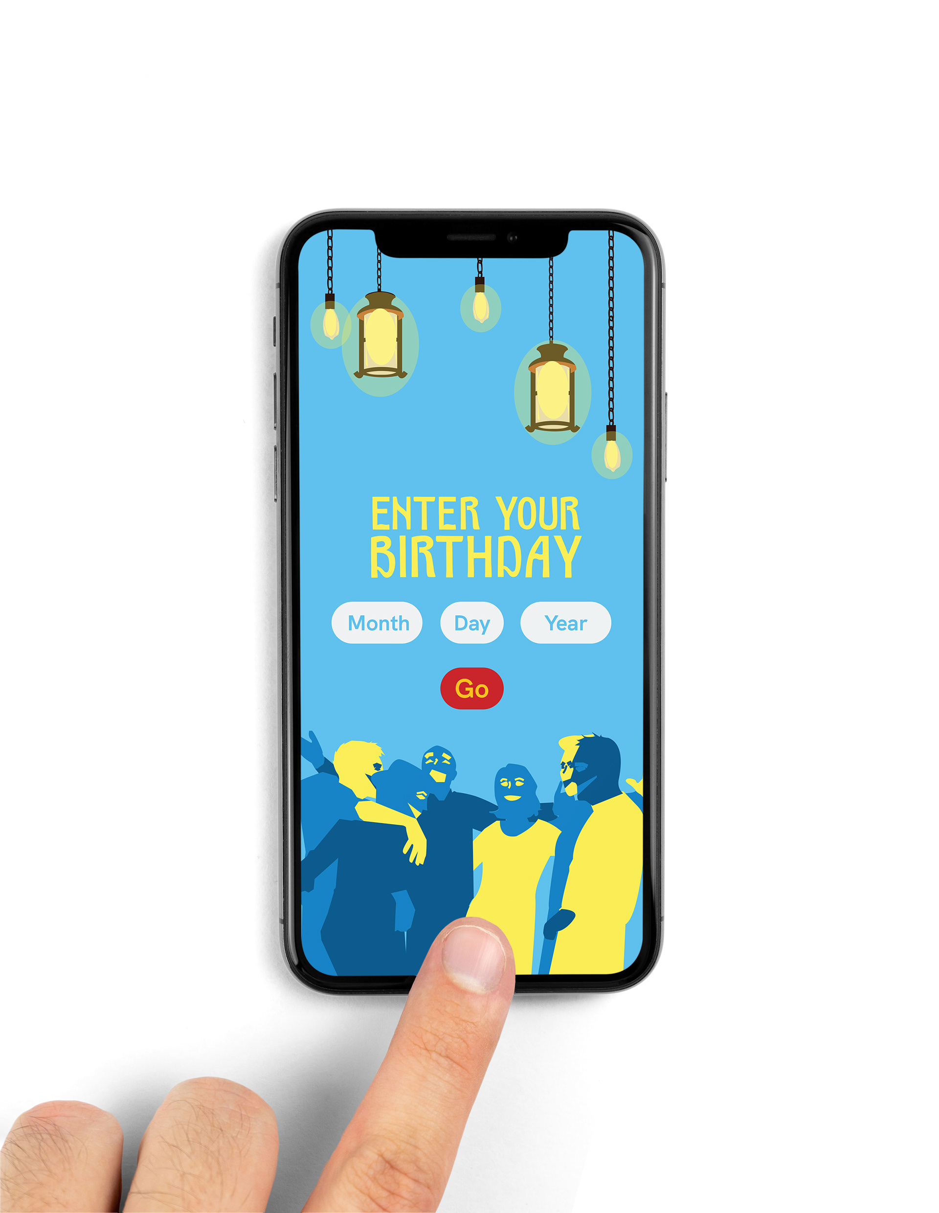
Close Up
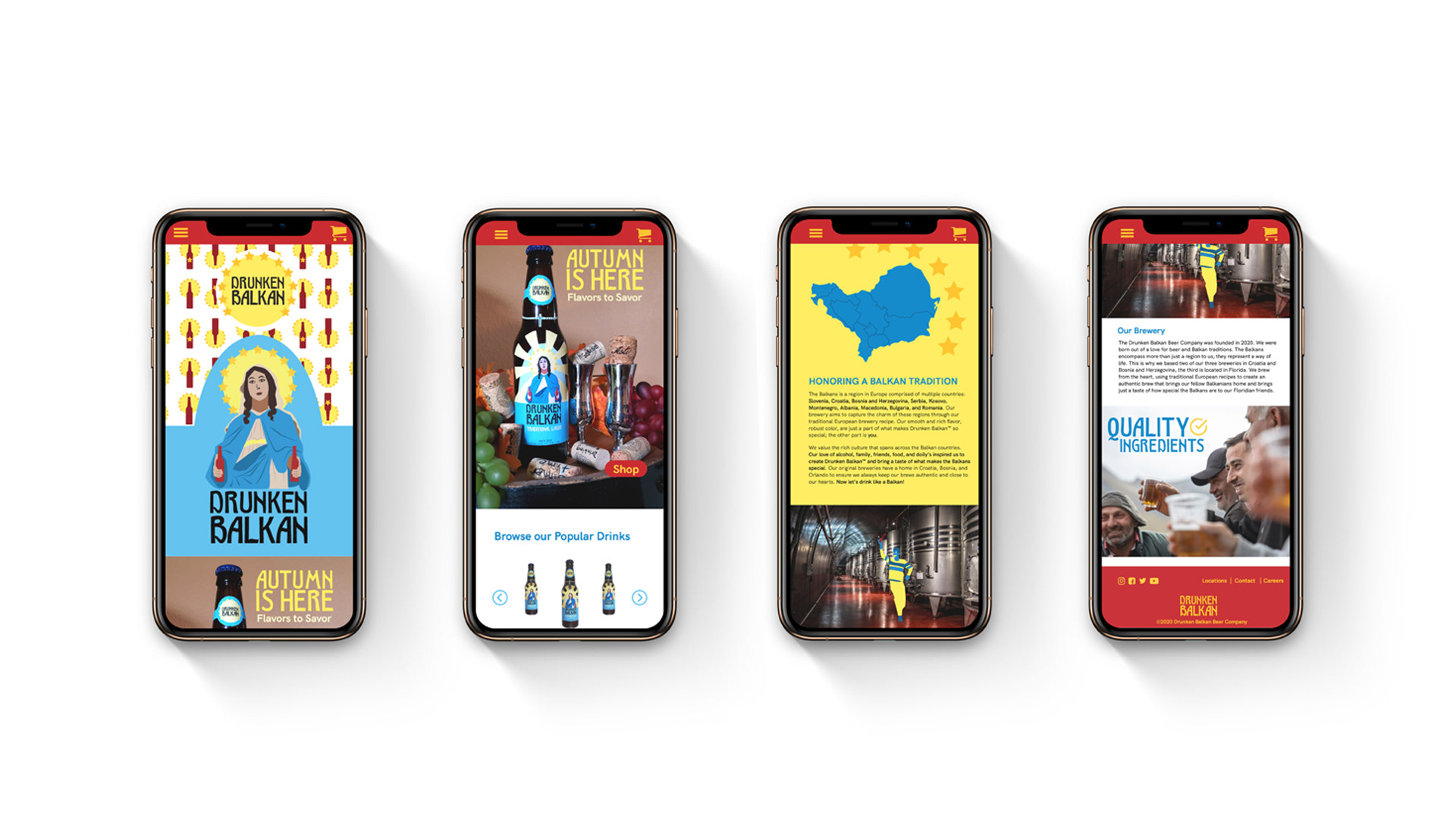
Home Page
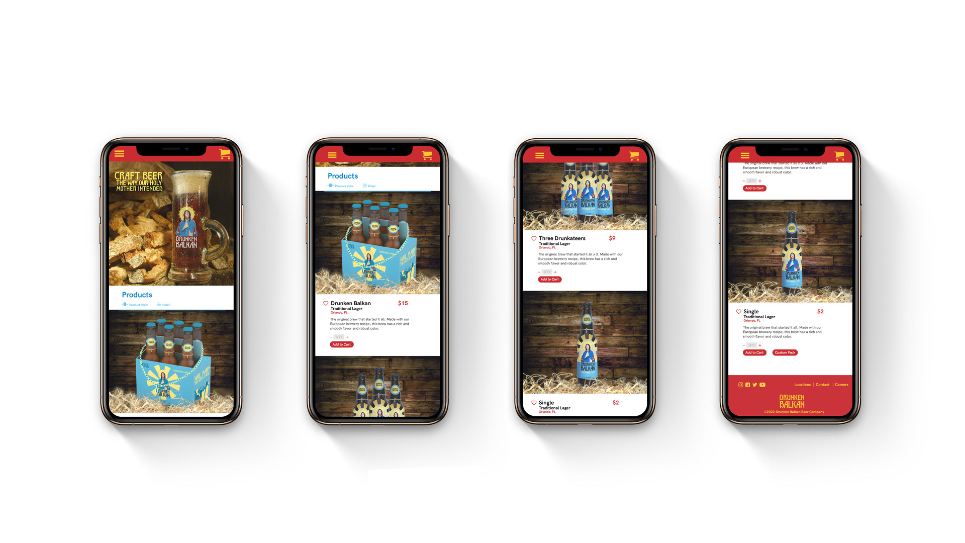
Product List View Page
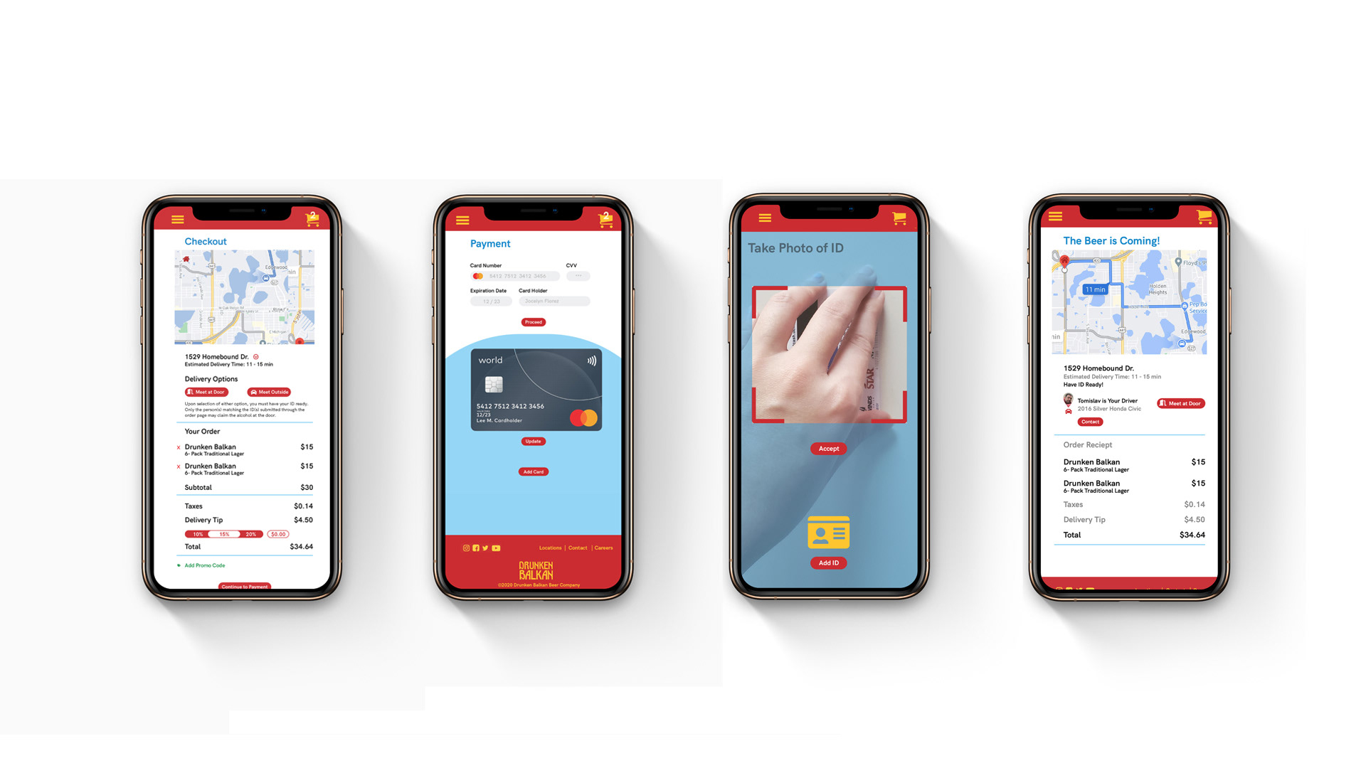
Checkout Page
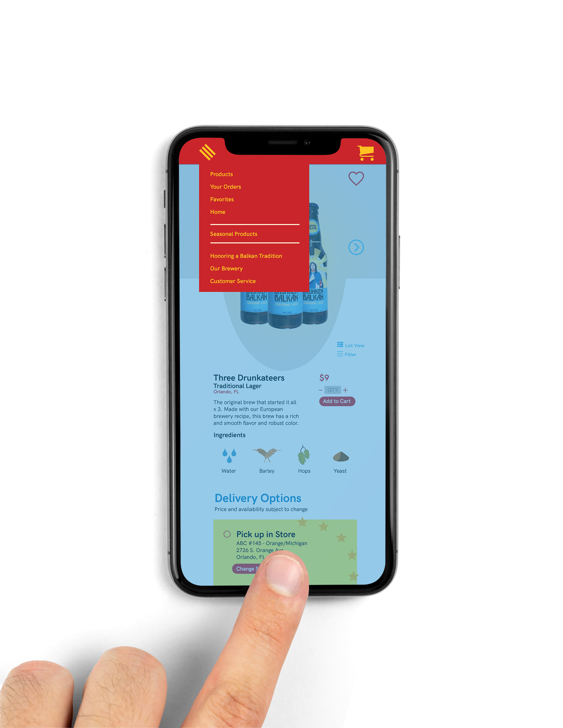
Open Nav
